Pages

Thursday, January 29, 2015

space

Started an online class to organize paper-related craft supplies. Some of the techniques may be useful with a yarn stash (e.g., creating a catalog of yarns by weight or fiber); I haven't tried to redo the current system I'm sort of using.

The craft organizing starts with deciding on the "big benefit", putting the overall goal on paper and establishing eight rewards (one for completing each challenge).  I recently picked up a lot of things through sales - these will be my rewards - I can use them after completing the weekly goal.

This 12x12 page counts towards my 52 scrap book pages for this year and prominently displays my big benefit for decluttering my craft room. I'll have more space to store my yarn :-).


I started with an ugly 12 x 12 pattern paper. Cut nine 4 inch squares from random scrap paper. Used decorative edge scissors to let some of the background paper peek through.  Added images cut from magazines - one is of a castle in France (my craft room is my castle), another of paint brushes, paint smudges, and a couple photos showing hanks of yarn.  Put in one photo of a megalith because it seems to represent a clear surface for thinking.  Two ATCs were added, they were made from scraps of paper.

Used the Kiwi lane Aspen Court border template as a resting space for the title "SPACE".  The word space was created by stenciling letters on a white scrap of card stock, coloring with Copic markers then cutting out.

The next step is to create four major categories for grouping everything and to purge what I will never use.

I'm imagining clear works surfaces and stickers grouped by themes.

Monday, September 29, 2014

Input Requested

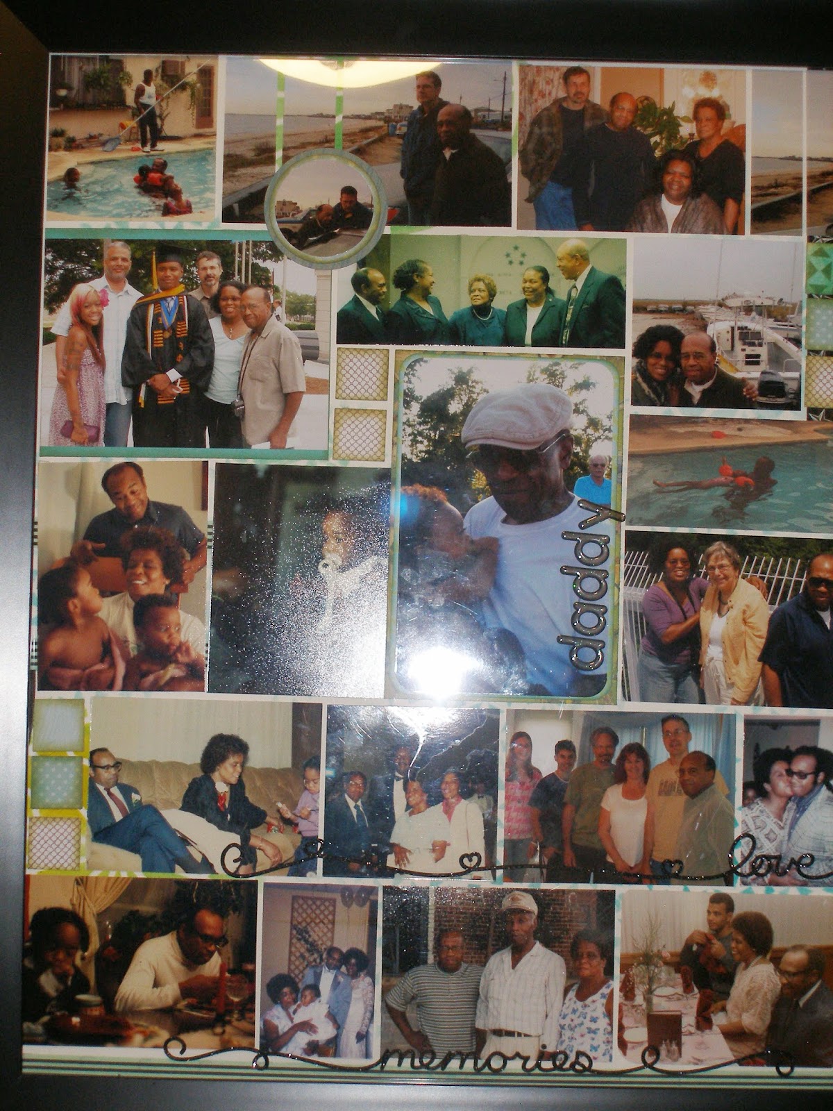
Taking a break from my week of two page scrapbook spreads to make shadow boxes for my father who passed away unexpectedly last week. Because I have never been one to add a lot of embellishments, I need advice on how to make these boxes "pop".  The first layout is completely Mosaic Momemts on a water color paper.  I did use the rule of thirds by starting with the largest image as an anchor.  I've added some strips of washi tape and three self-adhesive stickers.

The image has glare from the flash.  Please let me know what to add.
Thanks


Friday, September 19, 2014

Week 5: Stripping

Scrapbook Soup airs on PBS and has several seasons available on DVD as well as a few instructional videos on youtube. One show explains how to finish a page in about 30 minutes using a technique called photo strips.

The idea is to view a 12 x 12 layout with a large 4 x6 grid - either vertical or horizontal. By starting at the edge of your page, place photos until the page is covered.  Marking the grid isn't required.  Scrap paper or washi tape may be used to fill in any open spaces.  Or they can be used for titles, text, or embellishments.

 I used a photo strip in the lower half and Mosaic Moments to complete the upper half.
Here are some close ups of the embellishments used in this layout.
An epoxy sticker,
a Creative Memories (CM) sticker strip,
and CM letters on a stamped image of piano keys fill the last two inches
of middle photo which was a 4 x4.
Embossed stamp image cut from blue paper used as an embellishment.
0
This page uses the horizontal photo strips for the entire page and one section is left for a journal.


I punched out the restaurant's logo from their napkin holder, inked the edges and matted it.  Using pop dots, I placed it over the spoon and the green washi tape.  The utensils in the layout were stamped on scrap paper, cut out then inked along the edges before being added as embellishments.


I noticed this Kiwi Lane Design layout uses a vertical photo strip with a different approach.  Looks like it could be a fast layout to recreate with the right mix of patterned paper.
Geocaching Bella BLVD layout
More about this layout can be found at Geocaching

Sunday, September 7, 2014

Week 4: Triangle of Clusters

The visual triangle technique (placing three similar items on a single layout to create a triangle) is used on this two page spread by using clusters featuring a stamped flower.  
I have a container filled with embossing powders. By stamping six flowers then heat embossing them with gold powder, I used a minimal amount of this supply.  The flowers were stamped on scrap white card stock then fussy cut and colored with markers.


Embossed flower placed on cut out from patterned paper.


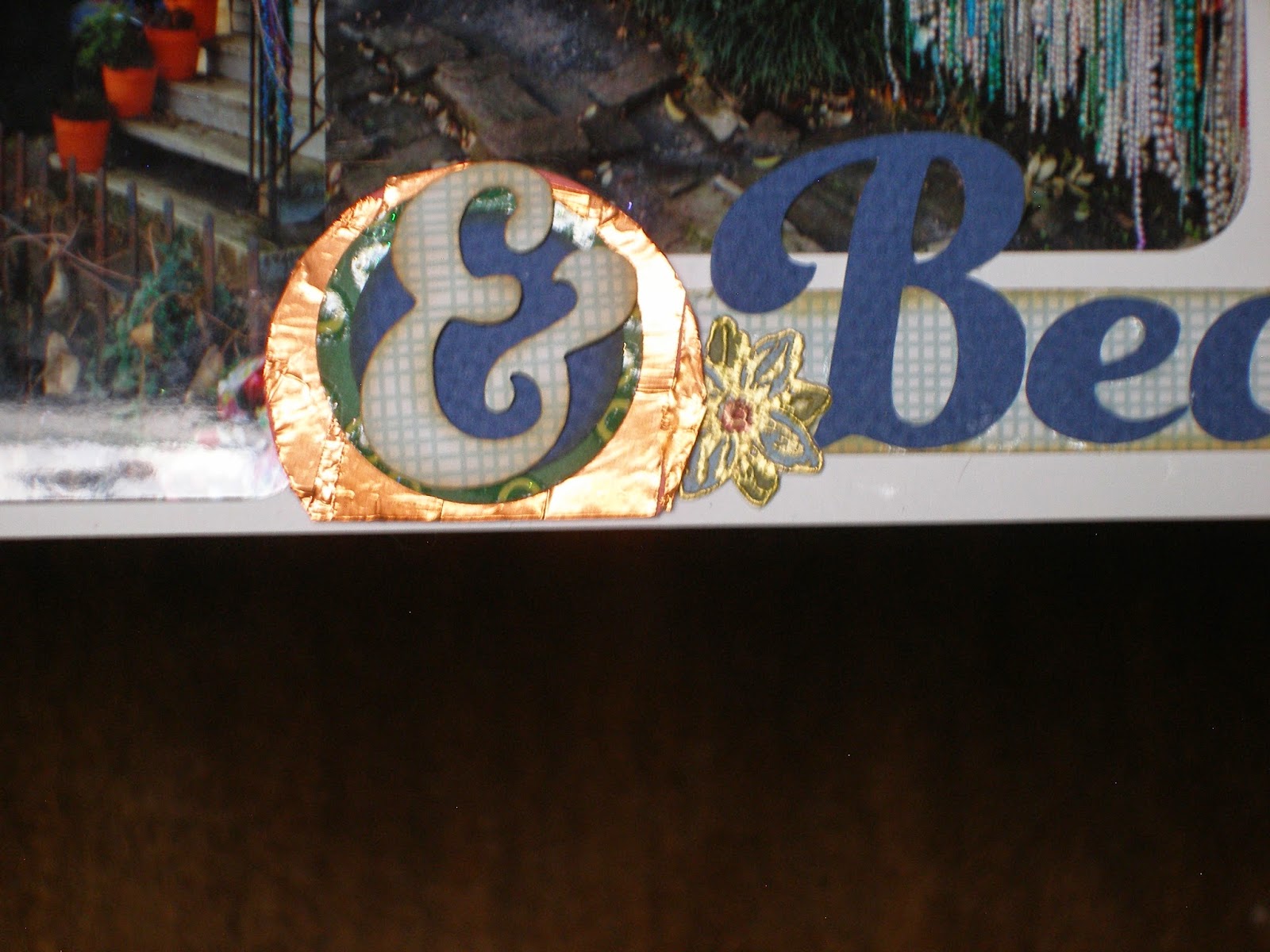
Covered a punched circle with copper tape to add more bling. Flower placed beneath disk.
The clusters have a few punch outs of a navy floral outline and "beads" cut from the patterned paper.  The paper is a winter/holiday paper called "Kris Kringle" made by SEI.  The colors perfectly capture the colors in the January sky. The letters were cut using the Cricut (Plaintin and Artiste cartridges)
Navy floral punch out with embossed flower and cut out.
This spread relies on the rule of thirds, the Mosaic Moments for adding in accent pieces, and the Kiwi Lane design templates for the adding the pattern pattern to a 12x12 white card stock.


Saturday, August 30, 2014

Week 3: Creating Clusters

Clusters are a great way to use non-matching stickers and scraps of patterned paper. Clusters are usually placed where you want the reader's eye to land and linger.  From my card making days, I rely on the number five as the minimum for layers related to a cluster. 

For the first page of this layout, I started with Tami Potter's Mosaic Moment approach  - seeing my page as a grid of squares.  I placed my enlarged photo on the upper left two thirds of the page.  The cluster below the photo is centered four inches from the left side.  

Cluster on first page with five layers of color.
The layering of the cluster:
  1. Gray card stock serves as the first layer.
  2. Patterned paper cut from a Kiwi Lane Design template is the second layer.
  3. A cream colored scroll from a sheet of stickers for Hawaii adds the third layer. 
  4. The mat cut from scrap pattern paper is the fourth layer. Edges have been inked.
  5. The store's logo cut from their menu is the fifth layer. Edges have been inked and the image is on pop dots. 

Adjacent to the main cluster is a smaller cluster of fruit and squares with fewer layers.
  1. Gray card stock is the first layer. 
  2. Squares cut from scrap paper are the second layer. 
  3. Cherry and lemon serve as the third layer. 
  4.  A small Hawaiian flower tops the lemon to give it another subtle layer. 
For the second page, a small cluster is in the lower right corner. The ticket peeking out beneath the photo mat serves as the second layer in this cluster.  The matted logo adds two more layers to the cluster.

Cluster is in the lower right third.
As I continue to complete the remaining of the 52 layouts, I hope to use at least one cluster on each page of  my usually sparsely embellished pages. 

Sunday, August 24, 2014

Week 2: Using Vertical Thirds with Mosaic Moments

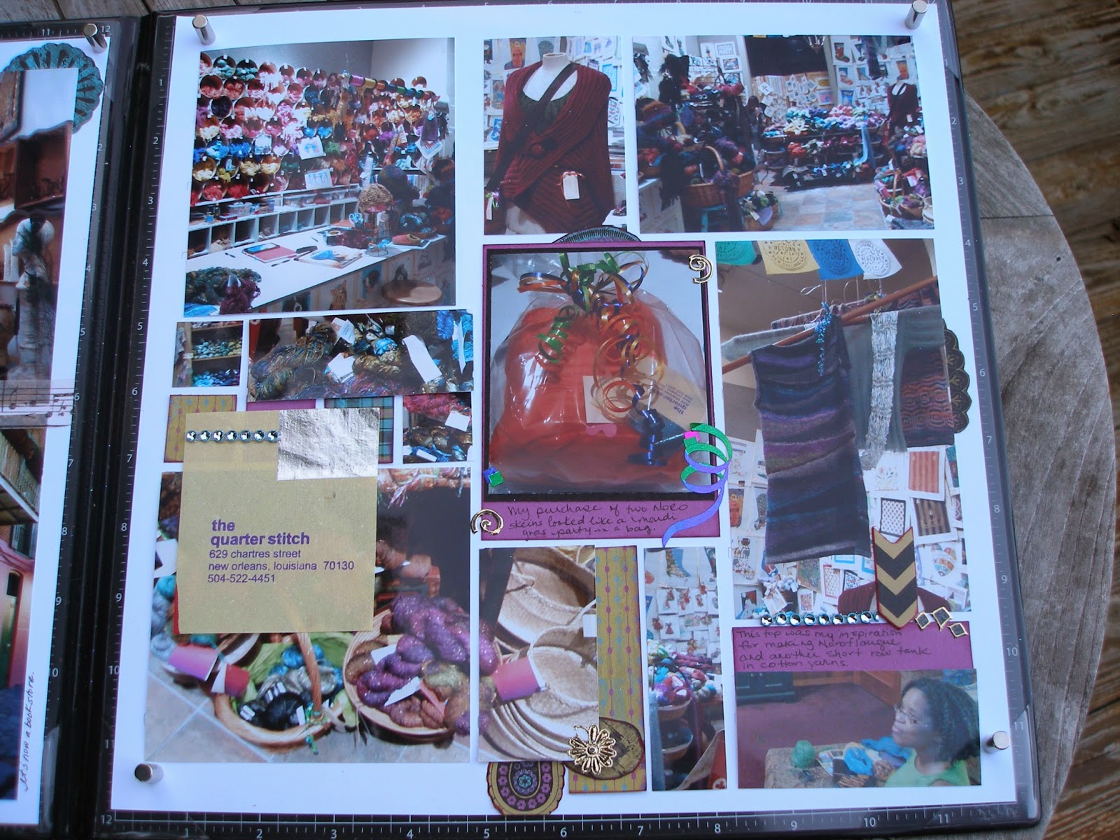
Tami Potter  created the Mosaic Moments approach to scrapbooking.  I use her approach most often because it is a great way to incorporate many photos into one layout. I like being able to fill a page without having embellishments everywhere.

Using the mosaic approach, it is easy to see the "thirds" on each layout.  On one page, I placed the date of the trip in the upper third on the right side of the page.  For the facing page, I placed the "the quarter stitch" business card on the lower third of the left side olumn.

For this spread, I tried to add in embellishments to soften the vertical lines.  I cut images from the patterned paper and placed them behind some photos. I also reached into my stash of stickers and got a little carried away. 

Sunday, August 17, 2014

Week 1: Vertical Thirds

Adding my first two-page layout with hopes of completing 52 spreads before my year of being 52 ends.  Each spread will be an attempt to reduce my collection of memorabilia and photographs while consuming my scrapbook and card making supplies. For some  knitters, SABLE is more than a color, it is an acronym, Stash Acquisition Beyond Life Expectancy. I think I've reached this limit for my scrapbook and card making endeavors. Maybe this year of 52 spreads in 52 weeks, I'll make a dent in the patterned paper, stickers, brads, and ribbons stored in my craft room.

Rule of thirds applied primarily vertically on 12x12 paper. As well as horizontally, the upper third has the journal box.
Kiwi Lane design templates used to cut scraps of paper which were added as embellishments.