Pages

Saturday, August 30, 2014

Week 3: Creating Clusters

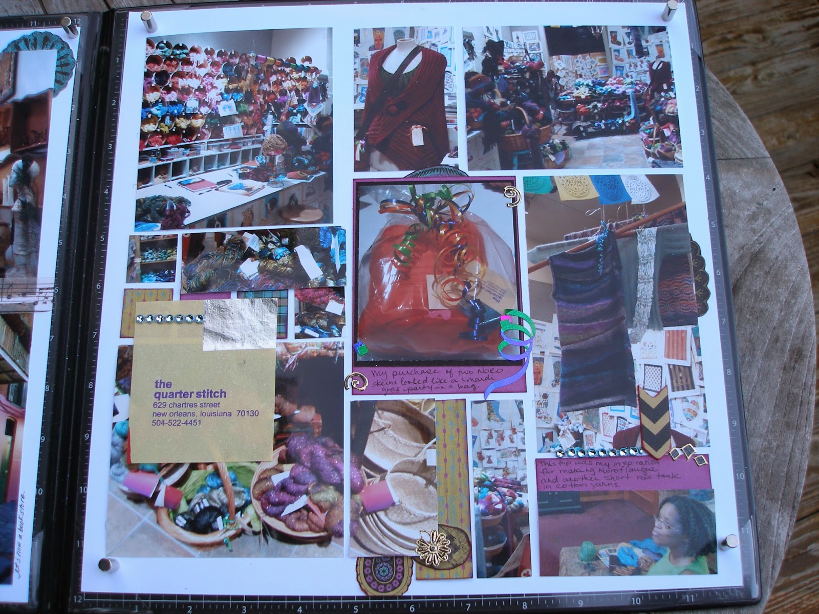
Clusters are a great way to use non-matching stickers and scraps of patterned paper. Clusters are usually placed where you want the reader's eye to land and linger.  From my card making days, I rely on the number five as the minimum for layers related to a cluster. 

For the first page of this layout, I started with Tami Potter's Mosaic Moment approach  - seeing my page as a grid of squares.  I placed my enlarged photo on the upper left two thirds of the page.  The cluster below the photo is centered four inches from the left side.  

Cluster on first page with five layers of color.
The layering of the cluster:
  1. Gray card stock serves as the first layer.
  2. Patterned paper cut from a Kiwi Lane Design template is the second layer.
  3. A cream colored scroll from a sheet of stickers for Hawaii adds the third layer. 
  4. The mat cut from scrap pattern paper is the fourth layer. Edges have been inked.
  5. The store's logo cut from their menu is the fifth layer. Edges have been inked and the image is on pop dots. 

Adjacent to the main cluster is a smaller cluster of fruit and squares with fewer layers.
  1. Gray card stock is the first layer. 
  2. Squares cut from scrap paper are the second layer. 
  3. Cherry and lemon serve as the third layer. 
  4.  A small Hawaiian flower tops the lemon to give it another subtle layer. 
For the second page, a small cluster is in the lower right corner. The ticket peeking out beneath the photo mat serves as the second layer in this cluster.  The matted logo adds two more layers to the cluster.

Cluster is in the lower right third.
As I continue to complete the remaining of the 52 layouts, I hope to use at least one cluster on each page of  my usually sparsely embellished pages. 

Sunday, August 24, 2014

Week 2: Using Vertical Thirds with Mosaic Moments

Tami Potter  created the Mosaic Moments approach to scrapbooking.  I use her approach most often because it is a great way to incorporate many photos into one layout. I like being able to fill a page without having embellishments everywhere.

Using the mosaic approach, it is easy to see the "thirds" on each layout.  On one page, I placed the date of the trip in the upper third on the right side of the page.  For the facing page, I placed the "the quarter stitch" business card on the lower third of the left side olumn.

For this spread, I tried to add in embellishments to soften the vertical lines.  I cut images from the patterned paper and placed them behind some photos. I also reached into my stash of stickers and got a little carried away. 

Sunday, August 17, 2014

Week 1: Vertical Thirds

Adding my first two-page layout with hopes of completing 52 spreads before my year of being 52 ends.  Each spread will be an attempt to reduce my collection of memorabilia and photographs while consuming my scrapbook and card making supplies. For some  knitters, SABLE is more than a color, it is an acronym, Stash Acquisition Beyond Life Expectancy. I think I've reached this limit for my scrapbook and card making endeavors. Maybe this year of 52 spreads in 52 weeks, I'll make a dent in the patterned paper, stickers, brads, and ribbons stored in my craft room.

Rule of thirds applied primarily vertically on 12x12 paper. As well as horizontally, the upper third has the journal box.
Kiwi Lane design templates used to cut scraps of paper which were added as embellishments.